
http://www.bscc.or.kr/citizen/01_perfor/?mcode=1001010400&mode=2&no=21245
전시프로그램 < 공연·전시안내 < 공연·전시안내 < 부산시민회관
공연전시안내,대관서비스,토요체험스쿨,부산시립예술단,커뮤니티,부산문화회관소개,정부3.0,고객센터,정기회원
www.bscc.or.kr

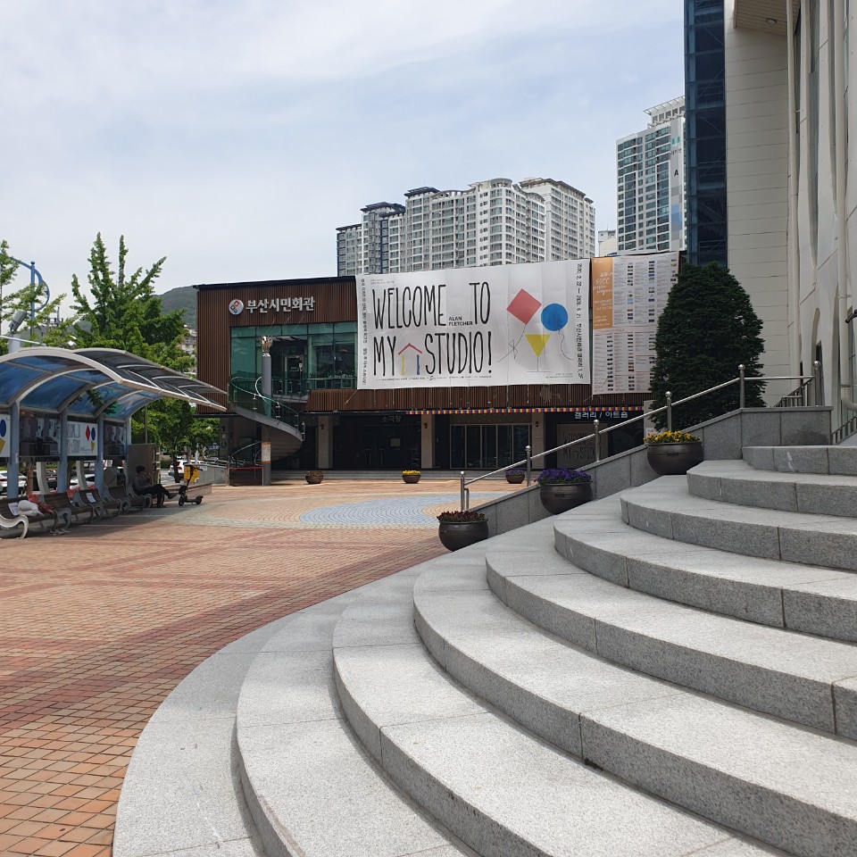
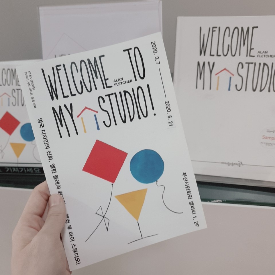
코로나가 잠잠해지다가 또 다시 기승을 부리지만...ㅜㅜ 평일 조용한 시간대에 외출 삼아 전시회를 다녀왔다. 어제 저녁쯤인가 오랜만에 부산시민회관 홈페이지를 들어가보았는데 꽤 볼만한 전시가 진행중이었다. "20세기 거장 시리즈, 영국 디자인의 신화, 앨런 플레처 회고전" 이라는 전시 제목에 확 구미가 당겼고 나는 운 좋게 지역 주민 할인으로 4500원이라는 아주 저렴힌 입장료를 내고 전시를 관람할 수 있었다. (신분증 지참) 기본 관람료는 성인 9000원이며 지역주민 할인 이 외에도 시민회관 홈페이지에서 가져온 위 전시정보를 확인해보면 다른 할인 정보에 대해서도 구체적으로 나와있다.
Corona's calming down and then on again, but...I went out to the exhibition during the quiet time of weekdays. I visited the website of the Busan Civic Center yesterday evening, and there was a pretty good exhibition going on. The title of the exhibition, "20th Century Master Series, The Myth of British Design, Alan Fletcher's Retrospective Exhibition," gave me a very cheap entrance fee of 4,500 won at a local resident's discount, and I was lucky to be able to see the exhibition. The basic admission fee is 9,000 won for adults, and in addition to the discount for local residents, if you check the exhibition information brought from the website of the civic center, you will find other discount information.

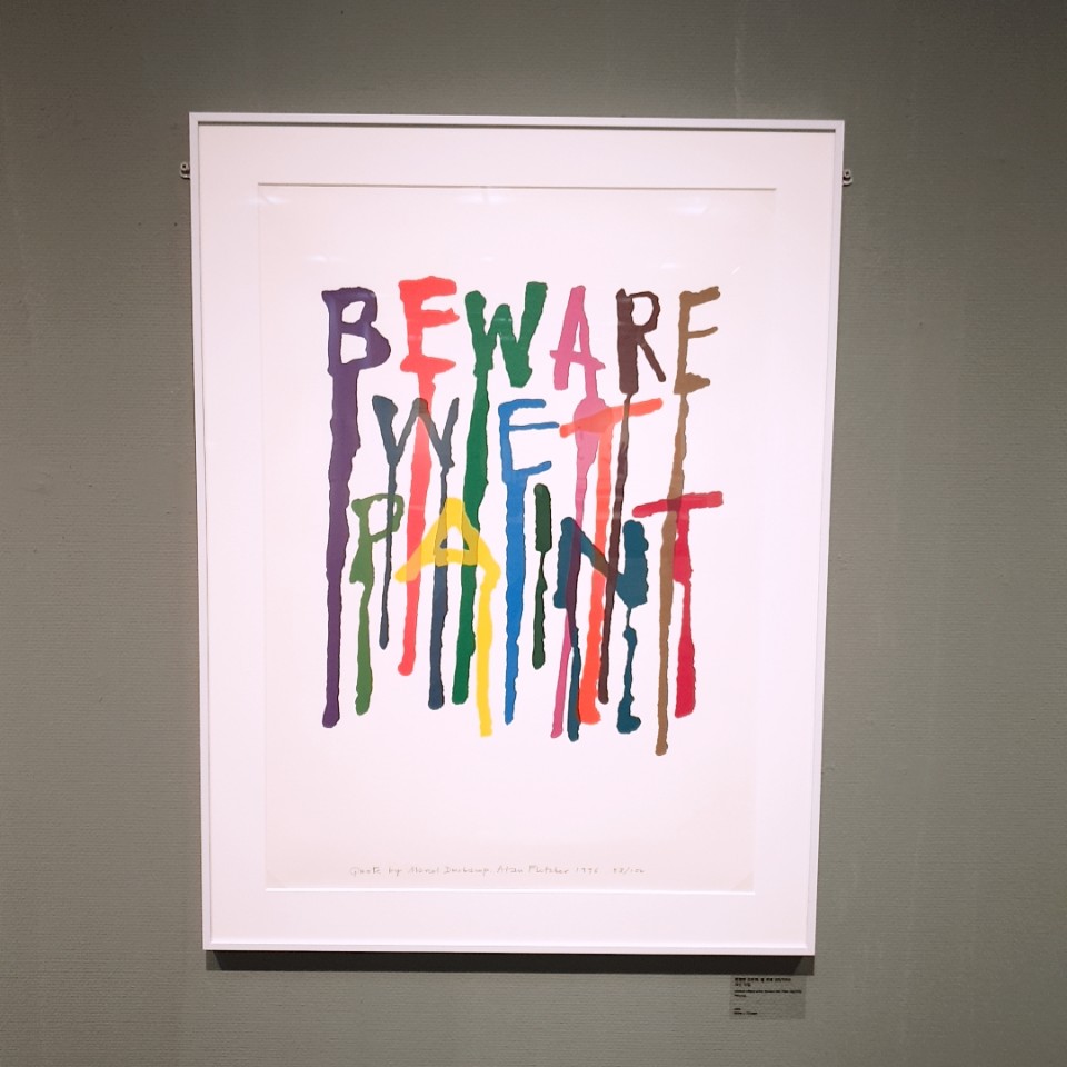
"앨렌 플레처 Alan Flecher"
현대적 의미의 그래픽 디자인을 영국에 처음 선보인 영국 디자인의 신화, 엘런 플레처.
(1931~2006)
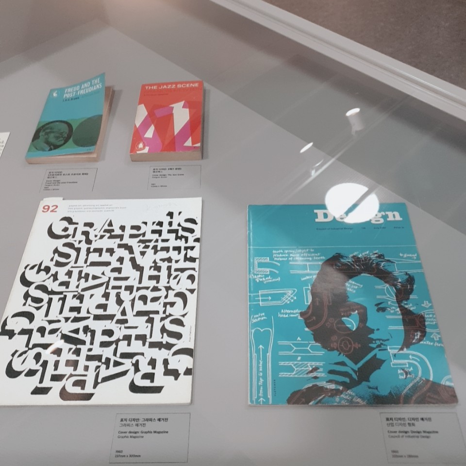
앨렌 플레처는 일생 동안 그래픽 디자이너이자 예술가로서 방대한 양의 작품을 남겼다. 잡지, 책, 포스터와 같은 인쇄물로부터 주요 기관들의 상징물까지 다종다양한 매체의 작품들을 남겨 당대 가장 중요한 디자이너 중 한명으로 평가 받고 있다. 또한 오늘날 디자인 스튜디오의 전신이라고 할 수 있는 세계적인 디자인 전문 컨설팅 회사인 '팬타그램( Pentagram)'의 창립 멤버로도 잘 알려져 있다.
풍부한 상상력과 남다른 시각으로 작업한 앨런 플레처의 작품들을 통해 20세기 영국 디자인의 역사를 살펴볼 수 있을 뿐만 아니라, 그 만의 세계를 경험하고 그 속에서 새로운 영감을 얻을 수 있을 것이다.
Allen Fletcher left a vast amount of work as a graphic designer and artist throughout his life. From printouts such as magazines, books and posters to symbols of major institutions, he is considered one of the most important designers of his time, leaving behind works from various media. He is also well known today as a founding member of Pentagram, a global design consulting firm that is the predecessor of a design studio.
Allan Fletcher's works, which have worked with rich imagination and extraordinary perspectives, will not only give you a glimpse into the history of 20th-century British design, but also experience his own world and get new inspiration from it.
1F 제 1전시실
1.뉴욕에서 런던으로 New York to London (1952~1962)
2.플레처|포브스|질 Feletcher|Forbes|Gill (1962~1965)
3.크로스비|플레처|포브스 Crosby|Fletcher|Forbes (1965~1972)
4.펜타그램 Pentagram (1972~1992)
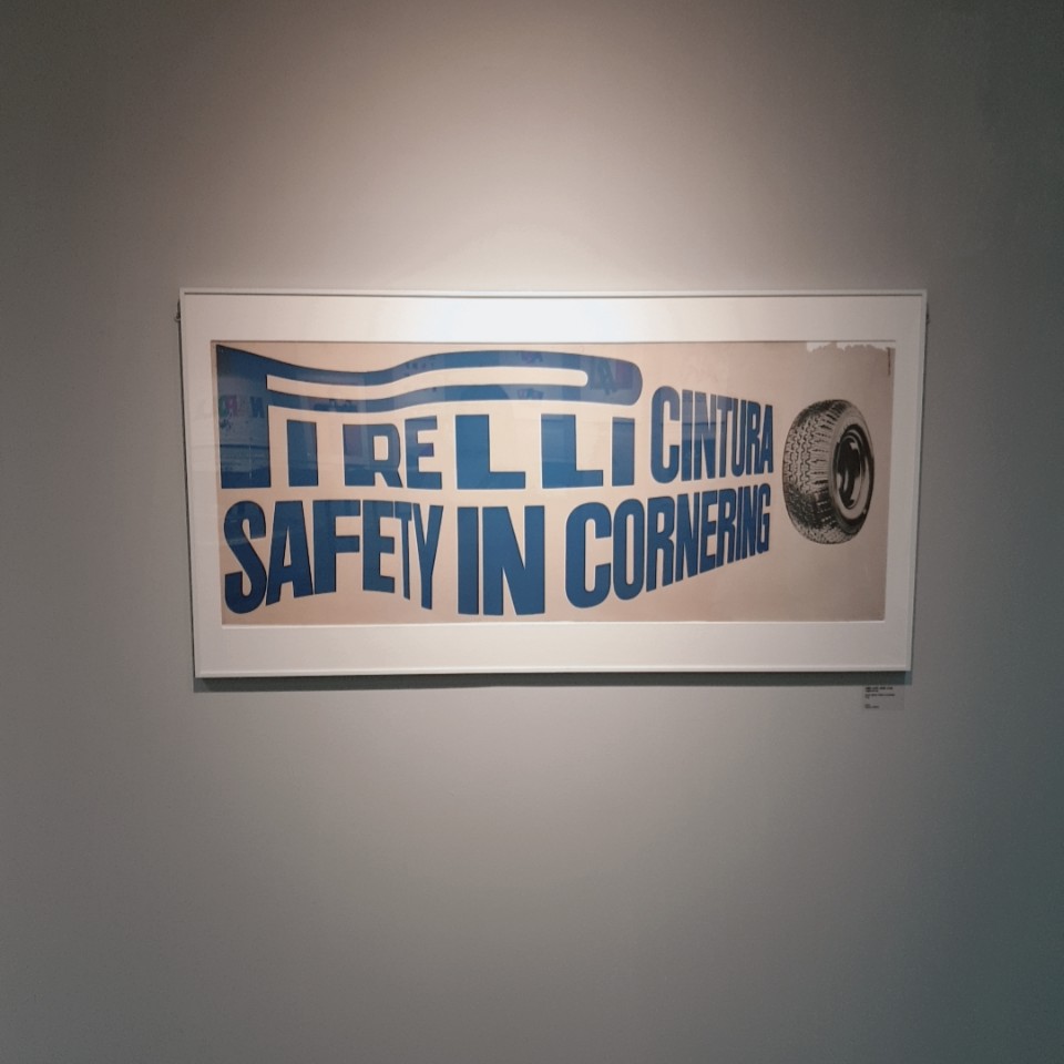
1950년대 초 영국은 전후의 어둡고 암울한 시기였다. 엘런 플레처는 이러한 분위기 속에 여러 학교를 다니며 디자인을 공부했다. 침체되어있던 런던의 분위기와 달리 뉴욕은 화려하고 에너지가 넘치는 곳이었다. 그곳에서 만난 당대 최고의 디자이너들 밑에서 배우며 플레처를 그래픽 디자이너로서 감각을 익혔다.
1960년대 초 런던으로 돌아왔을때도 상황은 크게 나아지지 않았다. 디자인은 여전히 상업적 영역으로 치부되었고 무채색의 공익 광고나 상품 광고를 위한 디자인 외에 큰 발전이 없었다. 플레처가 뉴욕에서 축적한 포트폴리오는 당시 영국에서 보지 못한 스타일이었기에 다른 디자인들과 비교하여 확실히 두드러졌다. 시각적으로 화려하고 균형 잡혀있었으며 1차원적인 이미지가 아닌 아이디어를 기반한 디자인이었다.
In the early 1950s, Britain was a dark and gloomy period after the war. Ellen Fletcher studied design at various schools in this atmosphere. Contrary to the stagnant atmosphere of London, New York was a colorful and energetic place. He learned how to play Fletcher as a graphic designer by learning from the best designers of the time he met there.
Things didn't get much better when I returned to London in the early 1960s. Design was still dismissed as a commercial area and there was no great development other than design for achromatic public service advertisement or product advertising. Fletcher's portfolio accumulated in New York was certainly outstanding compared to other designs because it was a style not seen in Britain at the time. It was visually colorful and balanced and was designed based on ideas, not one-dimensional images.
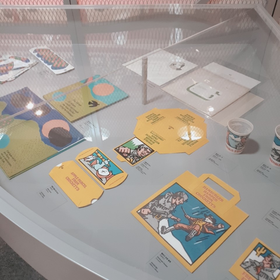
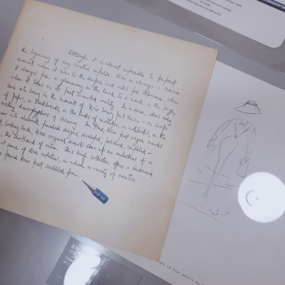
그의 작품들을 보면 현대의 그래픽 디자인과도 전혀 위화감이 없을 만큼 감각적인 많은 작업물들과 타이포그래피, 그 외에도 여러 포스터 작업, 명함, 팜플렛 등등 디자인적 가치가 두드러지는 많은 상업 작업물들을 확인 할 수 있다. 이 모든 작품들이 50년대 60년대에 작업한 것이라는게 믿겨 지지 않을 정도로 당시에는 얼마나 혁신적이었을지를 상상해볼 수 있는 부분이었다. 위의 팜플렛에서 발췌해온 글에서 읽을 수 있듯이 그저 무채색의 공익광고/상품광고 외에는 전혀 디자인적 발전이 없던 시기에 얼마나 다양한 시각적 발전을 그가 이뤄냈을지 감히 상상되지 않는다. 지금처럼 '포토샵'같은 컴퓨터 프로그램이 전혀 없었을 시절의 순수한 작업물들이라 '상업'적 목적을 둔 작업이라 할지라도 디자인적 가치가 더욱 묻어나는 작품들인 것 같다.
Looking at his works, you can see many works that are so sensuous that there is no sense of incompatibility with modern graphic design, and many other commercial works that stand out in design value, such as typography, various poster works, business cards, pamphlets, etc. It was hard to believe that all of these works were made in the '50s and '60s, and I could imagine how innovative they must have been at the time. I dare not imagine how diverse visual development he would have achieved at a time when there was no design development at all, except just achromatic public service/product advertising, as can be read in an article extracted from the pamphlet above. These are pure works when there were no computer programs like "Photo Shop" like now, so even those with "commercial" purposes seem to have more design value.


2F 제 2전시실
5. 앨런 플레처 디자인 Alan Fletcher Design (1992~2006)
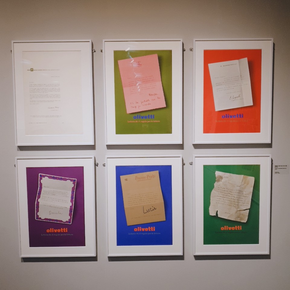
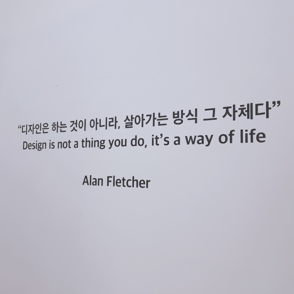
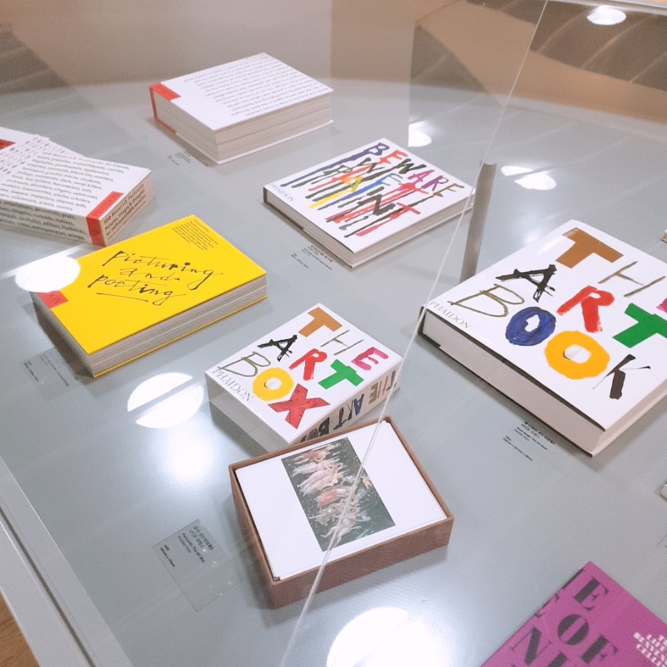
20년 가까이 팬타그램에서 일하며 지내던 플레처는 클라이언트들의 의뢰를 받아 기계적으로 작업하고 있는 자신을 발견하게 되고, 돌연 펜타그램을 나온다. "디자인은 하는 것이 아니라 살아가는 방식 그 자체"라고 말하며, 노팅 힐 게이트의 자택에 개인 스튜디오를 열고 작업을 이어갔다. 그는 예술서적 전문 출판사인 파이톤 프레스(Phaidon Press)의 자문위원이자 예술감독으로, 건축 및 디자인 전문 도무스(Dormus Magazine)의 디자이너로 활발히 활동하면서도 개인적인 작업을 하는데 시간을 아끼지 않았다.
그는 정형화된 스타일에 갇히지 않기 위해 오로지 본질만 남을 때까지 요소들을 줄이고 단순화 시켰다고 밝혔다. 또한 기술의 발달로 디지털 기반의 작업이 가능해졌음에도 불구하고 펜 글씨, 수채화, 콜라주와 같은 아날로그 기법을 고수했다. 자필로 쓴 타이포그래피를 두고 '쓰기(writing)'는 '그리기(drawing)'와 같다고 말하며, 글자 하나 하나가 상징이 될 수 있다고 믿었다.
Fletcher, who has been working on the Pantagram for nearly 20 years, finds himself working mechanically at the request of clients, and suddenly comes out of the pentagram. "Design is not about doing it, but the way it lives," he said, opening a private studio at his home at Notting Hill Gate and continuing his work. He is an advisor and artistic director of Phyidon Press, a publishing company specializing in art books, and an active designer of Domus Magazine, which specializes in architecture and design, but spared no time in doing personal work.
He said he had reduced and simplified the elements until only the essence remained in order not to get stuck in a formal style. It also adhered to analog techniques such as pen writing, watercolor painting and collage, despite the development of technology making digital-based work possible. As for the self-written typography, "writing" is like "drawing," and believed each letter could be a symbol.
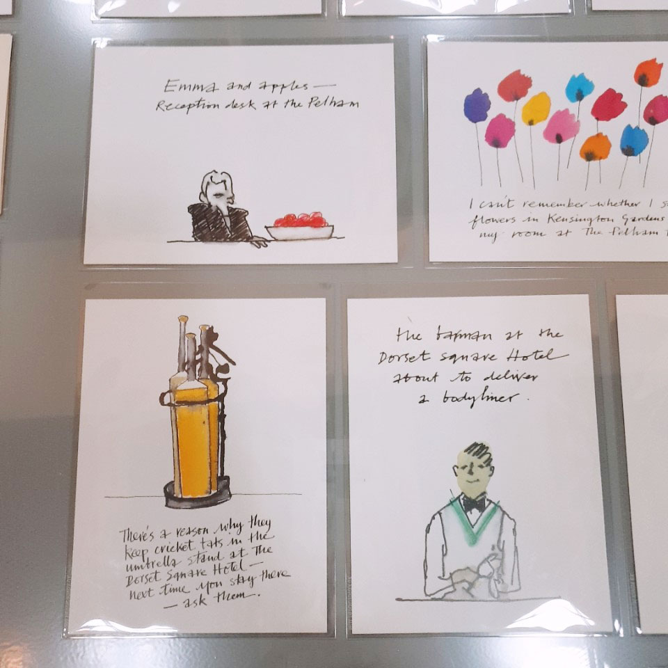
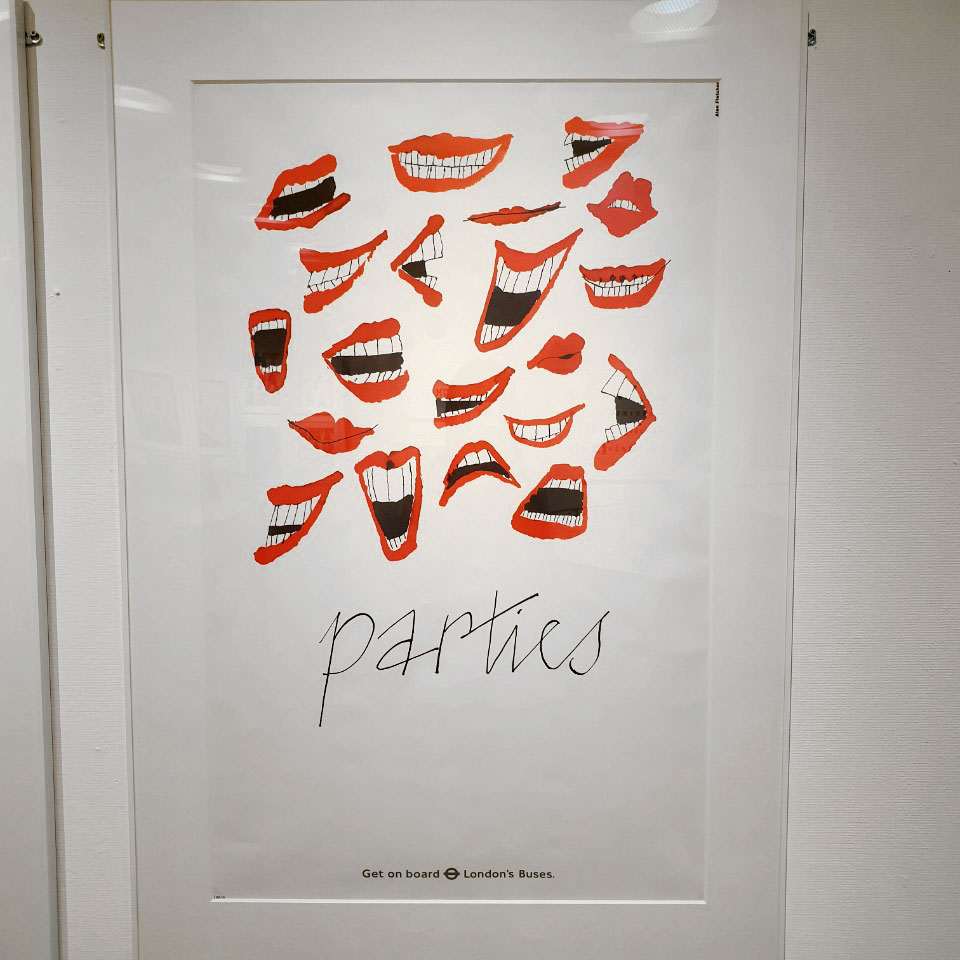
제2 전시실에는 그가 개인 스튜디오에서 집중적으로 그의 작업에 몰두 한 시절의 작품들이 즐비해있다. 나는 레터링을 활용한 그의 포스터 시리즈들을 가장 흥미롭게 보았고 그의 아날로그 감각이 느껴지는 손글씨 작업, 스케치, 군더더기 없이 깔끔하고 자유로운 터치가 돋보이는 그림과 채색들이 마음에 들었다. 그가 손수 작업한 글쓰기 작업들은 마치 지금으로치면 캘리그래피와 비슷한 것 같다. 그 외에도 엽서 처럼 제작한 그의 아기자기한 일러스트 그림들이 참 매력적이다. 최소한의 스케치와 최소한의 채색만으로 '단순화'시킨 그의 작업에서 고도로 절제되었지만 전혀 모자랄 것도 없는 심플한 감각들이 느껴졌다고 해야될까. 최소한의 터치로 충분한 시너지를 발휘할 수 있는 시각적 작업물을 완성한다는 것이야 말로 '좋은 디자인'에 아주 적합한 것이라 느껴진다.
The second exhibition room is full of works from his time when he focused on his work in a private studio. I found his poster series using lettering the most interesting and liked the hand-written work, sketches, and paintings and colors that showed off his clean and free touch without a pile of piles. His hand-written writing seems to be similar to calligraphy at this time. In addition, his cute illustrations, which were made like postcards, are very attractive. His work, which "simpleized" with minimal sketches and minimal coloring, felt a sense of simplicity that was highly restrained but not lacking at all. Completing a visual work that can create enough synergy with minimal touch seems to be a perfect fit for a "good design."


2층 입구 데스트 바로 옆에는 그의 작품을 기반으로 한 굿즈샵이 작게 마련되어 있다. 거의 대부분 그렇듯, 에코백, 엽서, 문구 용품들이 대부분이다.
1층 2층으로 나뉘어져 있어 꽤 많은 그의 작품들을 감상 할 수 있고, 사실 빈티지/아날로그 감성을 덧댄 현대의 그래픽 작업물이라고 해도 큰 어색함이 없을 정도로 수십년이 지난 작업물들에서 유행을 타지 않는 듯한 그만의 '감각'을 엿볼 수 있었던 흥미로운 시간 이었다. 어찌됐건 6월 21일까지 월-일 연중무휴 오픈되는 전시라고 하니 날짜에 압박 받지 않고 또 부담 없는 할인 가격으로 즐길 수 있었던 좋은 전시회였다.
Just next to the entrance on the second floor, there is a small goods shop based on his work. As with most, eco-bags, postcards and stationery are mostly.
It was an interesting time when he could appreciate quite a few of his works, divided into the first and second floors, and in fact, he could get a glimpse of his own "sense" that seemed to be out of style in decades-old works, even if they were modern graphic works with vintage/analog sensibility. Anyway, it was a good exhibition that was open 24/7 until June 21 and was able to enjoy it at an affordable discount without being pressured by the date.
'문화_예술 > 예술_전시_공연' 카테고리의 다른 글
| 부산 상상마당 전시 "ANOTHER REALITY" 어나더 리얼리티 - 밤의 미술관 (4) | 2020.09.19 |
|---|---|
| 부산 현대미술관 무료 전시 - '기술'에 관하여, 오늘의 질문들, EMOTION IN MOTION 전시 관람 리뷰 및 전시관람 온라인 사전 예약하기 (4) | 2020.05.22 |
| Forest : 영원은 죽어가다 (스튜디오 퓨어파이브)_부산 미술 전시 (feat.호주 산불) (0) | 2020.01.12 |
| 부산현대미술관 - "시간밖의 기록자들" Chroniclers, Outside of Time (0) | 2020.01.11 |
| <스타일은 영원하다> '노만 파킨슨' 부산 전시_리뷰 (0) | 2019.06.08 |